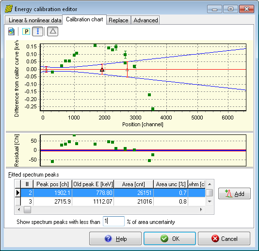
The energy calibration chart allows you to overview the quality of the calibration.
This sheet contains the chart itself at the top, a residual at middle, and a list of candidate fitted peaks at the bottom.
The chart shows the calibration line with red, the standard uncertainty of the calculated energy values in blue; the calibration points' difference from the energy calibration line as filled green rectangles.
The peak list may be used to add new points quickly to the calibration. The peak list is filtered to display the significant peaks only: only the peaks with less than 1% peak area uncertainty will be displayed – however, this value can be edited under the list.
If you find too few peaks in the list, change this value to, say, 5%, and all the peaks below this limit will be listed immediately. To quickly add a peak to the calibration as a new point, click on its row, and click the Add button beside the list.